
Climate change visualizations & warming stripes in the wild!
SciArt, SciComm, Climate change ·I study the effects of temperature on disease transmission, so I’m always looking out for good ways to illustrate and communicate the impact of climate change.
Some of the best visualizations are made by Ed Hawkins’s project The Climate Lab Book (also on Twitter).
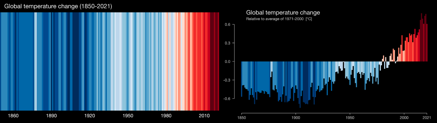
One of his creations that you’ve probably seen around is warming stripes, a set of red and blue stripes where each stripe is one year in the time sequence and the color intensity represents how much that year deviated from the global mean temperature. He even has a site where you can make your own warming stripes for a specific location and generate either the classic stripes or a bar-graph type output.
Warming stripes been featured in a lot of media and art projects, and even turned into clothing, including the new Reading FC home jerseys. (Dr. Hawkins is a meteorology professor at University of Reading.) You may also have noticed that I chose it for the header image on my Press page.
Still, it caught me off guard and made me very excited when I saw warming stripes painted on the side of a building this summer while crossing E. Houston Street on Elizabeth Street in New York City.

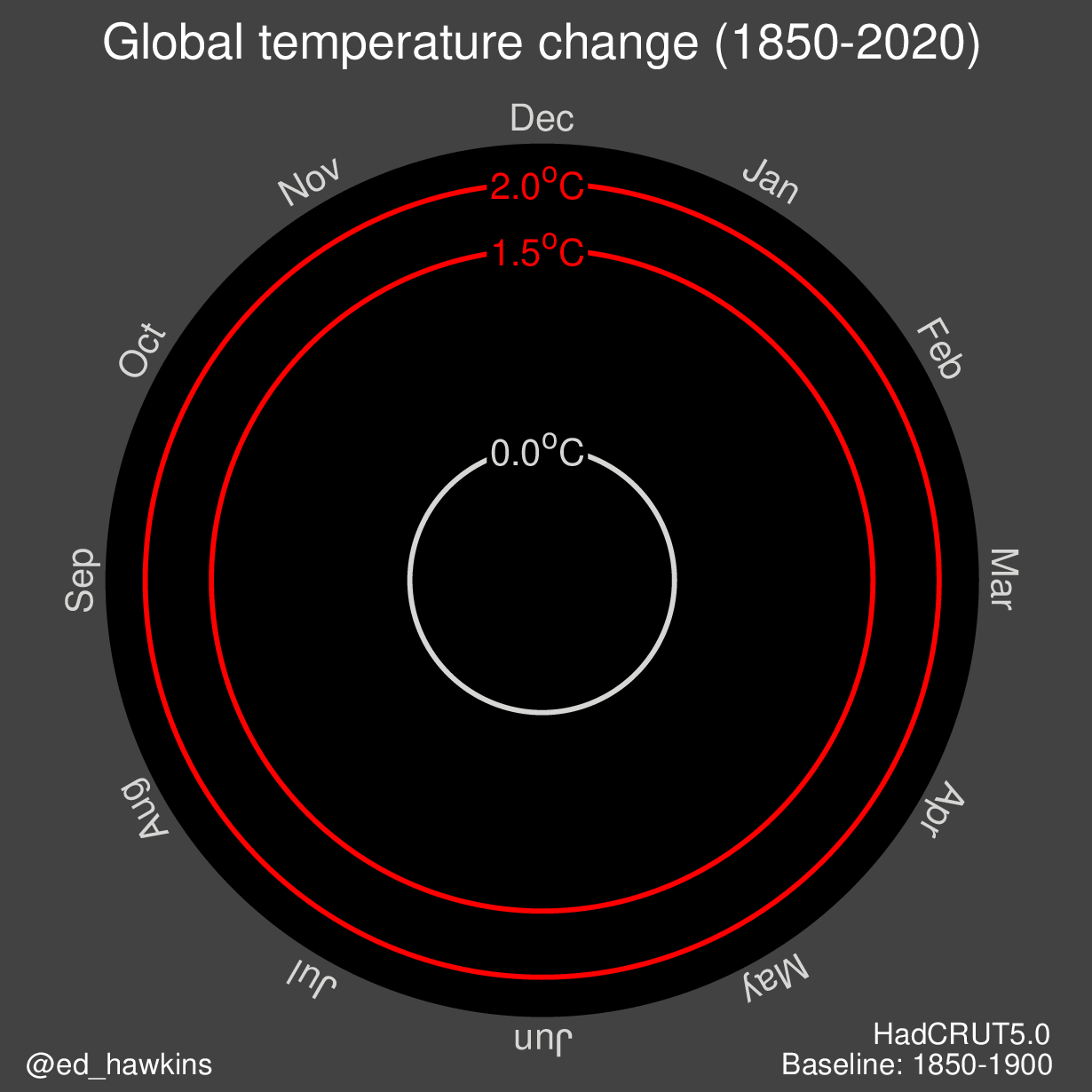
Hawkins’ other claim to climate-visualization fame is the climate spiral. In these spirals — which are often shown as dynamic, animated gifs — time is continuous (instead of having discrete years like the warming stripes), the time of year is represented by the line rotating around the circle, the line color shows the progression of time, and temperature is indicated by distance from the center of the circle.
The original version was in two dimensions:
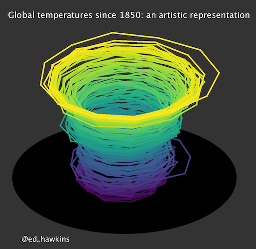
But more recently climate spirals have expanded to three dimensions and become more of a climate cup, including an animated version published by NASA in March of this year that’s been getting more attention on Twitter this week.
If you have any other climate change visualizations that you love, feel free to reach out to me on Twitter: @MartaShocket or via email.